Layout System
Most themes require ideal content – images in a specified aspect ratio and median text lengths. But real-world content is messy. Long headlines break layouts, short ones aren’t noticeable enough, portrait images scale out of proportion and create awkward gaps, and removing unwanted elements from the theme breaks the layout.
Themes that look great on demo sites fall apart in production and force you into extra work of adapting your content to the website’s specifications for each piece of content.
Neutrino's Smart Frame
Neutrino’s layout engine is built on top of Ghost's three-width system (standard, wide, and full). It combines multiple standard design techniques such as proportional scaling, CSS container cropping, and auto-optimization to achieve optimal design despite significant differences in possible content input.
Why This Matters
For Content Creators
- No content compromises: Use any image aspect ratio, any text length (within Ghost’s limits), and any possible site configuration.
- No extra work: Publish content in the form it was originally intended
- Consistent quality: Create with confidence that every page works and looks great on any device without testing
For Readers
- No broken layouts: Content always displays correctly
- Optimal readability: Fine-tuned typography for comfortable reading on every device
- Optimal viewability: Best use of available real estate on every device type for displaying images and playing video
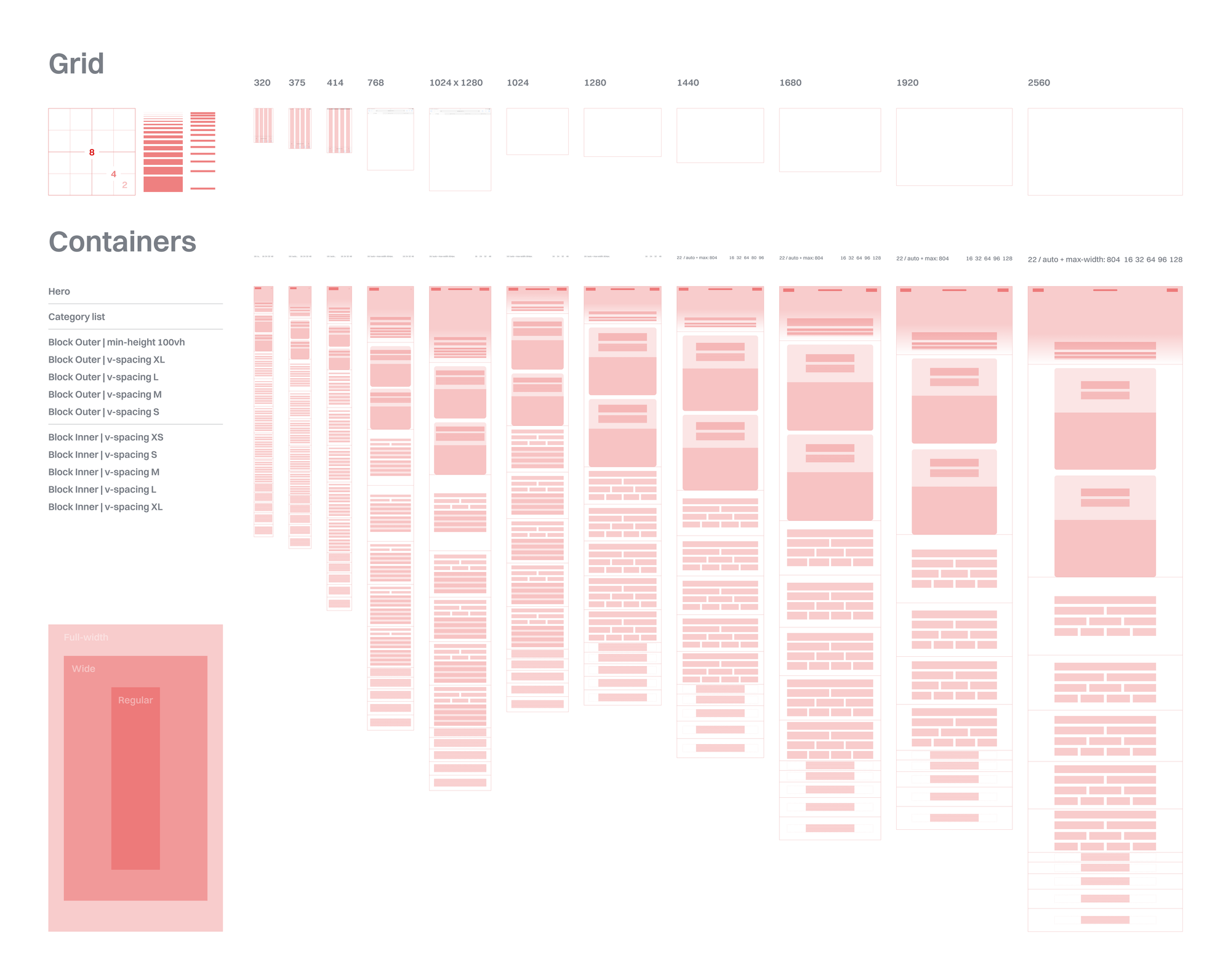
8px Unit Grid
Every measurement follows an 8px unit scale: 8, 12, 16, 20, 24, 32, 40, 48, 56, 64, 80, 96, 128, 192. This creates predictable rhythm and ensures elements align naturally across the design.
Example: A button is 56px tall on a tablet and 64px on desktop. Margins might be 32px on mobile, 64px on tablet, and 96px on desktop. Everything scales proportionally.
Responsive Breakpoints
Neutrino is micro-optimized for 12 specific viewport ranges:
Mobile: 320-374px, 375-413px, 414-743px
Tablet: 744-819px, 820-1023px, 1024-1279px
Netbook: 1280-1439px, 1440-1679px,
Laptop: 1680-1919px
Desktop: 1920-2559px+
Each breakpoint has fine-tuned typography and spacings – not just basic size changes, but holistic optimization for each device category.
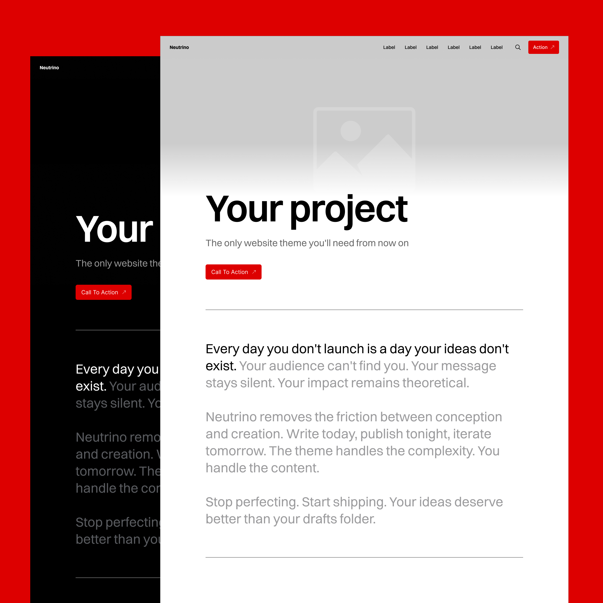
Full Screen Hero Cover
The hero section deals with double variability of aspect ratio:
- Device screen orientation
- Image orientation
Its design handles extreme variations such as 9:22 phone screenshots and 21:9 ultra-wide panoramas by providing a setting for how the image should be displayed on horizontal versus vertical screens.
The subject of the image can be perfectly framed by positioning the image Left, Center, Right, Top, Middle, Bottom, or Fit within the viewport for each orientation context separately.
When published without an image, the full screen container collapses into a standard title section using an elegance of golden ratio with the viewport height.
Title Size Auto-Optimization
Hero and footer H1 headlines’ font size scales depending on text length. Short titles scale up to maintain visual hierarchy and achieve a pleasing, perhaps even dramatic, editorial effect of the Hero Cover section. Long titles scale down to ensure enough visible real estate for the Hero image to be visible and intelligible.
Real example: "About" is huge. "The Complete Guide to Modern Web Design Principles and Best Practices" scales down automatically. No manual adjustment needed.
Smart Content Blocks
Header & Signup Blocks
These blocks use a combination of resizing, reflowing, alignment, and container overflow cropping to handle any variations in:
- Block size/type configuration
- Text length
- Image aspect ratio
Article Post Lists
Post lists achieve an optimal user experience on all devices by maintaining:
- Single column top-down list view
- Horizontal center alignment for optimal reading and ergonomics
- Text size and position regardless of whether the post has a hero image or not
Under-the-hood optimizations:
- Images: Always 16:9 (use landscape framing setting)
- Card: 1:1 (mobile) and 4:5 (laptop/desktop)
- Text: responsive typography and text truncation
Footer
Does its job equally well regardless of which of the following 12 combinations you configure it into:
Newsletter ON/OFF
Handles the following configuration combinations:
- Social links
- Heading + Social links
- Newsletter form + Heading + Social links
Number of Social Links
Automatically optimizes layout in case of:
- No links: RSS icon only
- Few links: Left-aligned
- Many links: Justified spacing
- Too many: Scrollable container
The Invisible Achievement
The best thing about this system is that users don’t think about it. Content creators upload the content “plug-and-play.” Website visitors experience a polished result. The thousands of micro-decisions happen automatically, hidden in plain sight.
Albeit a small feat, its purpose isn’t technological showcase. The exhaustive amount of handling edge cases by accounting for every combination, considering every proportion, and optimizing every breakpoint range serves only one purpose: to achieve near-perfect UX.