Navigation Options
Adaptive Contrast System
Neutrino's navigation automatically switches between black and white text to ensure readability against any background. This works with hero images, custom background colors, and light/dark mode settings – configured globally or overridden per page/post.
The system analyzes dominant colors and adjusts in real-time, eliminating manual color tweaking and ensuring your navigation is always legible regardless of the hero image or color scheme.
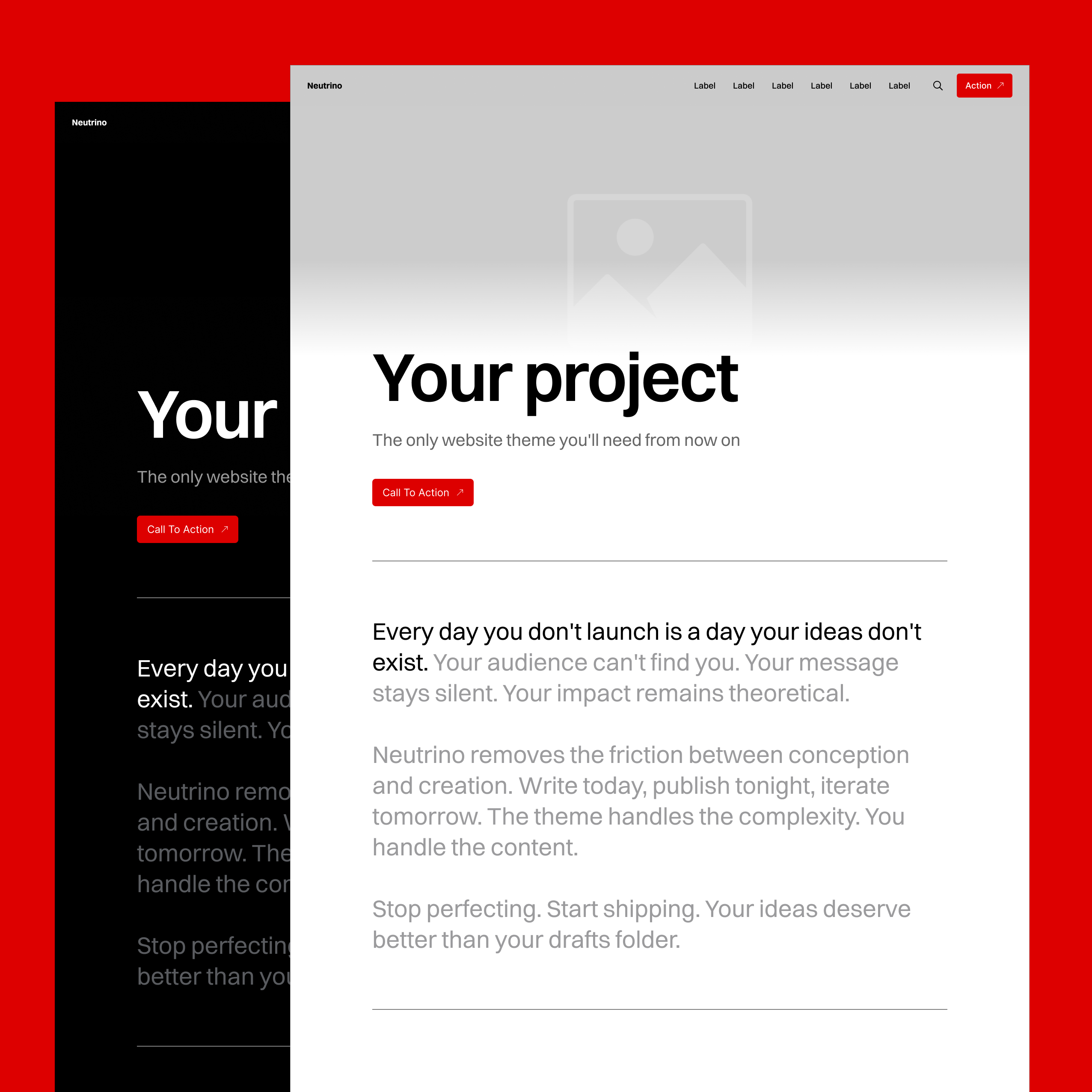
Desktop Navigation
Primary Navigation (Header)
Displays as a horizontal string of links, right-aligned by default. When you have extensive navigation items, the theme handles overflow gracefully with inline scrolling and gradient fade-out effects – no broken layouts or wrapped navigation.
Features:
- Clean horizontal layout
- Automatic overflow handling with scroll
- Gradient fade indicators for hidden items
- Logo/site name with smart contrast
- Optional CTA button via theme settings
Secondary Navigation (Footer)
Flexible footer system that adapts to your configuration automatically. Whether you have minimal links or extensive navigation, the layout adjusts intelligently.
Mobile Navigation
Responsive Collapse
Navigation transforms into a hamburger menu on mobile devices, opening as a full-screen overlay with background blur effect that matches Neutrino's design language.
Implementation:
- Hamburger icon with proper touch targets
- Smooth overlay animation
- Background blur for readability
- Vertical link list optimized for thumb navigation
- Maintains contrast system on overlay
Footer Configurations
The footer automatically adjusts its layout based on what elements you've enabled, ensuring perfect presentation regardless of settings combination.
Minimal Setup
Few social links: RSS + social icons (left-aligned)
Many social links: RSS + social icons (justified spacing)
With Site Branding
Few social links: Title + RSS + social (right-aligned)
Many social links: Title + RSS + social (justified spacing)
Full Configuration
Newsletter + few links: Form + title + RSS + social (right-aligned)
Newsletter + many links: Form + title + RSS + social (justified spacing)
Each permutation is optimized for all screen sizes. No manual adjustments needed – the theme handles spacing, alignment, and responsive behavior automatically.
Link Intelligence
Visual Indicators
Neutrino distinguishes between internal and external links with subtle arrow indicators:
- Internal links:
→(right arrow) - External links:
↗(northeast arrow)
This universal system appears on navigation items, buttons, and CTAs throughout the theme, helping users understand where links will take them before clicking.
Smart Link Handling
The theme automatically detects link types and applies appropriate behavior:
- Internal links use smooth transitions
- External links can be set to open in new tabs
- Anchor links trigger smooth scrolling
- Email/phone links open default apps
Navigation CTA
Add a prominent call-to-action button directly to your header navigation through Ghost's theme customization panel.
Configuration:
- Set button text in theme settings
- Define internal or external URL
- Inherits accent color automatically
- Maintains visibility across all pages
- Responsive sizing on mobile
Use cases: Subscribe, Sign up, Get started, Book demo, Download app
Coming Soon
Multi-Level Navigation
Two-level dropdown support for both header and footer navigation, allowing for more complex site structures while maintaining clean design.
Center Alignment Option
Choose between right-aligned (current) or center-aligned navigation, providing more layout flexibility for different brand styles.
These features are currently in development and will be available in the next major update.