Style Guide All
Basic Typography Specimens H2-H6 With Extended Text Examples
This is how second-level headings appear. They create major sections within your content, providing visual hierarchy without overwhelming the primary title. Notice the spacing above and below – carefully calibrated to create breathing room.
This Third Level Heading Also Extends Across Multiple Lines to Show How the Theme Handles Longer Headlines
Third-level headings nest within sections, creating subcategories of thought. They're smaller than their H2 parents but still command attention. Perfect for breaking down complex topics into digestible pieces.
Fourth Level Headings Can Also Run Long, Though at This Size They Begin to Resemble Bold Body Text
Fourth-level headings get progressively smaller, maintaining hierarchy while becoming more intimate. At this level, we're getting into the details – the fine print that still deserves structure.
Fifth Level Headings Are Barely Larger Than Body Text but They Still Maintain Their Role in Document Structure
By the fifth level, headings become barely distinguishable from bold text, yet they maintain their semantic importance. These are for the truly obsessive organizers among us.
Sixth Level Headings Are the Smallest in the Hierarchy and Even When They Extend to Multiple Lines They Whisper Rather Than Shout
The sixth and final heading level whispers rather than shouts. It's here for completeness, for those edge cases where five levels of hierarchy just aren't enough.
Heading with a Link That Extends to Show How Links Behave Within Longer Headlines
Sometimes headings need to go somewhere. This heading contains a link, styled to maintain readability while indicating interactivity. Hover over it. Click if you dare. You'll only end up back here.
This is a standard paragraph. The workhorse of web typography. Neither too large nor too small, with line height optimized for extended reading. These paragraphs can run long, expressing complete thoughts across multiple sentences. They can contain bold text for emphasis, italic text for subtlety, and even links to other places. The paragraph is the foundation upon which all long-form content is built.
Quotations
This is a small quote. A brief thought pulled from the text, highlighted for emphasis. It might be a key insight, a memorable phrase, or simply something worth repeating.
The space between elements matters as much as the elements themselves. This transitional paragraph provides breathing room between different block types, preventing visual collision while maintaining narrative flow.
Here's another paragraph to demonstrate spacing. Notice how paragraphs maintain consistent rhythm, creating a vertical cadence that guides the eye downward. This spacing isn't arbitrary – it's mathematically derived from the base unit system, ensuring harmony across all elements.
"This is a big quote. When someone says something particularly profound or when you need to make a statement that demands attention, the large quote format ensures it won't be missed. The increased size and distinctive styling create a natural pause in the reading rhythm."
Images
Regular Width
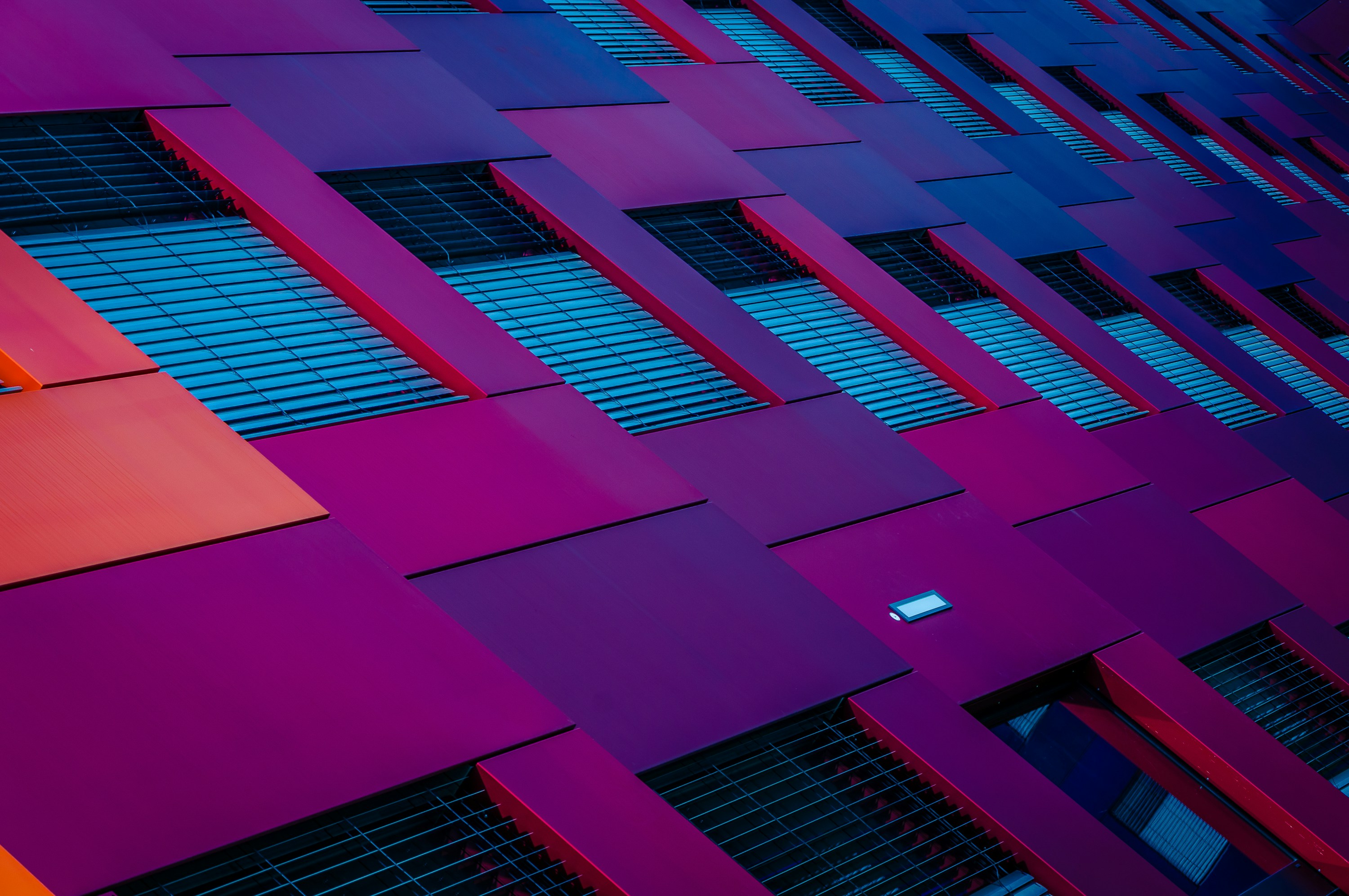
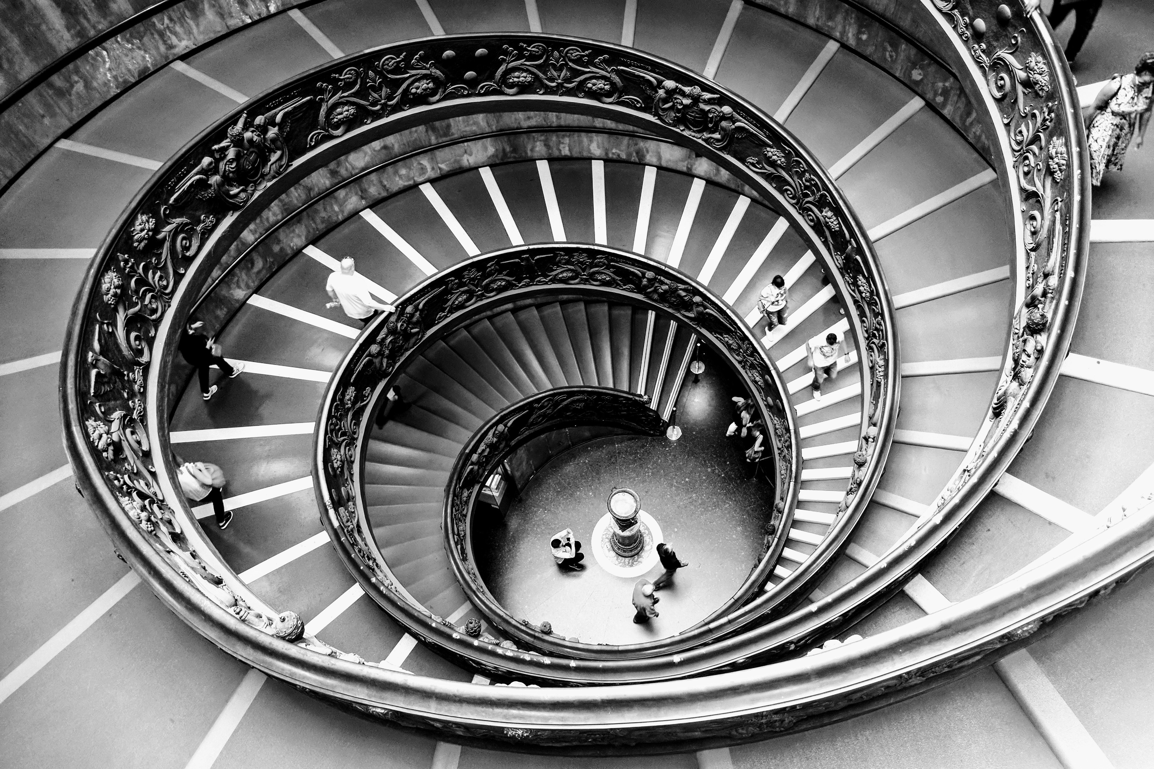
This is a regular width image. It stays within the content column, maintaining readable line lengths for surrounding text. Perfect for supporting imagery that doesn't need to dominate.

Wide Width
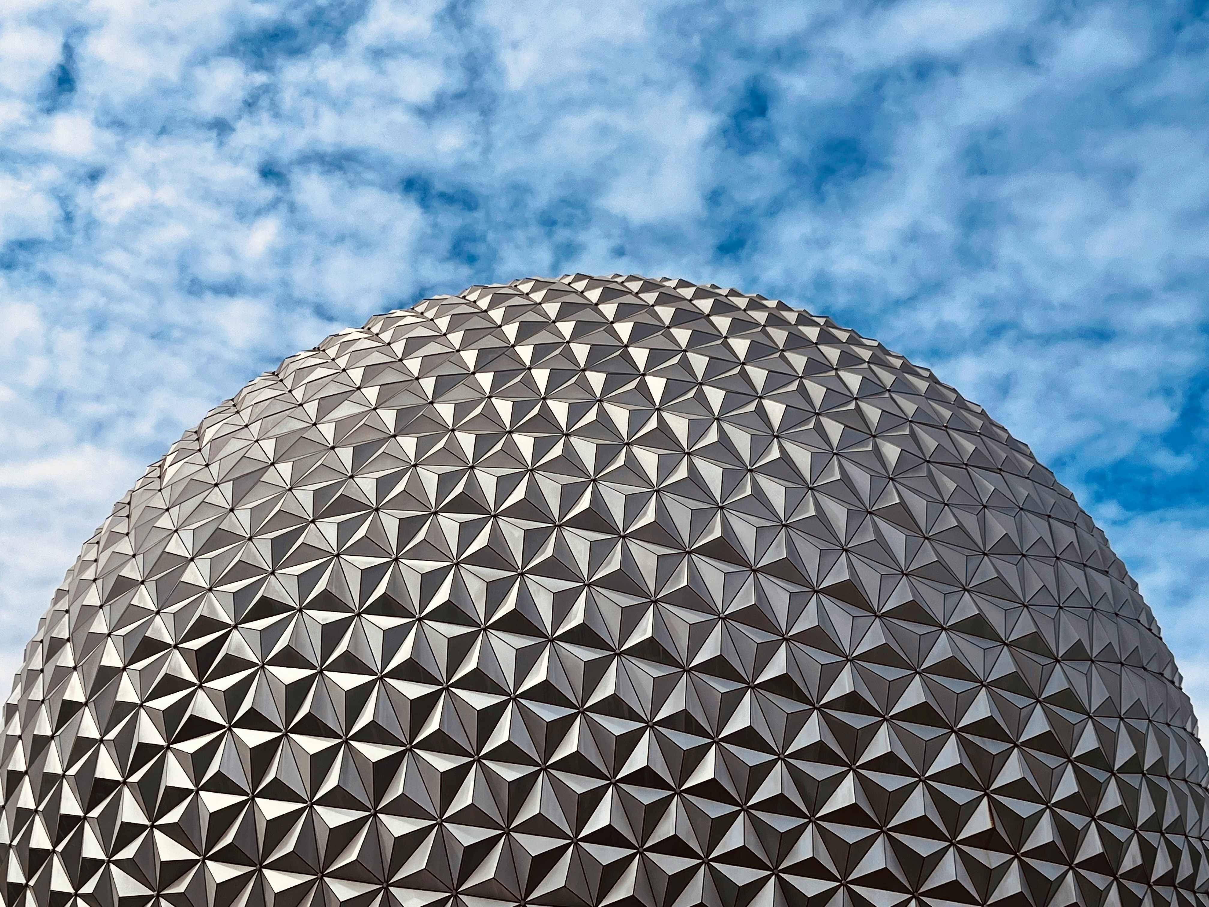
Wide images break out of the content column slightly, creating visual interest without overwhelming. They draw attention while maintaining relationship to the text.

Full Width
Full-width images demand attention. They create chapter breaks, section dividers, or simply moments of visual drama. Use sparingly for maximum effect.

Gallery
Galleries present multiple images in an organized grid. They maintain consistent spacing and automatically adjust to different screen sizes. Each image can be viewed individually or as part of the collection.


Interactive Elements
Buttons
Buttons are used for call-to-actions that link to other pages. This left-aligned button sits on the edge of the Wide width so it can be combined with the big blocks.
Center-aligned buttons on posts are shifted to left-align with the main text column. On pages they are aligned to the horizontal center so they can be combined with the Header block.
Bookmarks
Bookmarks create rich previews of external content. They're more engaging than simple links, providing context before the click. The theme automatically generates these from URLs, pulling metadata to create informative cards.
 Author
 Natan Nikolic
Lists
Unordered Lists
- This is an unordered list item
- Each item receives a bullet point
- The bullets align with the text edge
- Nested items indent further
- Creating hierarchical relationships
- Third level nesting is possible
- Though rarely necessary
- Use sparingly for clarity
- Back to second level
- Back to the main level
- Lists can contain any length of text, wrapping naturally while maintaining the relationship between bullet and content
Ordered Lists
- Ordered lists number their items
- The numbers increment automatically
- Perfect for step-by-step instructions
- Nested items use different numbering
- Maintaining clear hierarchy
- Third level uses yet another style
- Creating clear visual distinction
- Between hierarchy levels
- Second level continues
- The spacing between items creates scannable content
- Long items wrap properly, with subsequent lines aligning to the text, not the number
Toggle (Accordion)
What is a toggle block and when should I use it?
Toggle blocks, also known as accordions, allow you to hide detailed information behind a clickable header. They're perfect for FAQs, additional details that might overwhelm the main narrative, or progressive disclosure of complex information. This particular toggle explains its own existence, creating a meta-commentary on information architecture.
How does the toggle animation work?
The toggle animation uses smooth transitions to reveal hidden content. When clicked, the arrow indicator rotates, the content area expands, and the text fades in. This creates a polished interaction that feels native to the theme. The animation duration is precisely timed to feel responsive without being jarring.
Can toggles contain rich content?
Absolutely. Toggles can contain any content type – paragraphs, lists, images, even other embeds. This makes them incredibly versatile for organizing complex information. You could hide entire tutorials, detailed specifications, or supplementary content that enriches the main narrative without cluttering it. The styling remains consistent regardless of what's inside.
Definition List
Term One
Term Two
Term Three
Video
Regular Width
Regular width videos maintain the content column, perfect for supporting video content that accompanies text.
Video regular width caption
Wide Width
Wide videos create more cinematic presentations while maintaining relationship to surrounding content.
Video wide width caption
Full Width
Full-width videos create immersive experiences, perfect for hero sections or dramatic storytelling moments.
Video full width caption
Content Cards
File Download
File cards make downloads visible and informative.
Audio File
Audio card is a built-in player, allowing inline listening without leaving the page.
Product Card
Product cards showcase items with all necessary information for purchase decisions, styled consistently with the theme's aesthetic.
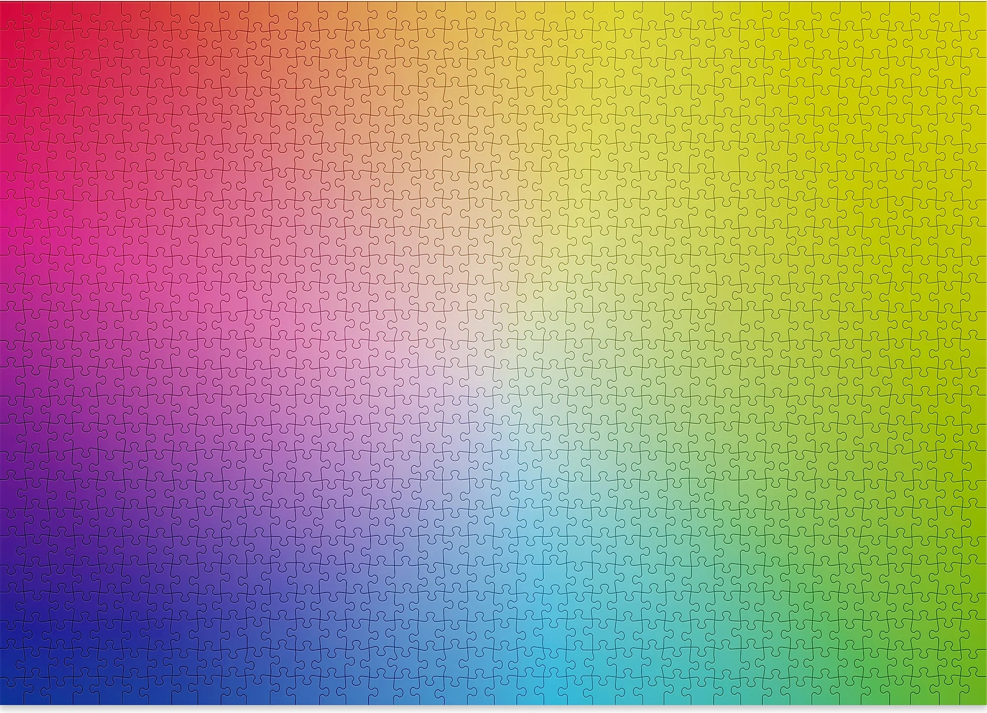
Gradient Puzzle - 1000 Pieces
A jigsaw puzzle that's also a meditation on color theory. No image, just a perfect gradient from blue to green (or red to yellow, or other combinations). Fiendishly difficult, oddly soothing, and gorgeous when complete. The ultimate procrastination tool disguised as design art.
Callouts
Tables
Regular Table
Regular tables fit within the content column, perfect for structured data that relates to surrounding text.
| Column Header | Description | Status | Date Modified |
|---|---|---|---|
| First data row | This is a longer description | Active | 2024-11-15 |
| Second entry | Brief description | Pending | 2024-11-14 |
| Third longer item | Another lengthy description | Complete | 2024-11-13 |
| Fourth row | Minimal text | Active | 2024-11-12 |
| Fifth entry | Medium length description text | On Hold | 2024-11-11 |
| Sixth data point | This description extends further | Active | 2024-11-10 |
Wide Table
| ID | Product Name | Category | Description | Specifications | Price Range | Availability | Stock Level | Supplier | Last Updated | Rating | Reviews |
|---|---|---|---|---|---|---|---|---|---|---|---|
| 001 | Professional Widget Pro | Hardware | This is an extended description showing how wide tables handle longer content | 15x10x5cm, 500g, Aluminum | $150-200 | In Stock | 245 units | Supplier A | 2024-11-15 | 4.5/5 | 1,234 |
| 002 | Standard Component Set | Components | A comprehensive set of standardized parts | Various sizes, Steel/Plastic | $75-100 | Limited | 45 units | Supplier B | 2024-11-14 | 4.2/5 | 567 |
| 003 | Deluxe Solution Package | Software | Complete software suite with extended features and support | Multi-platform, Cloud-enabled | $500-750 | Available | Unlimited | Internal | 2024-11-13 | 4.8/5 | 2,890 |
| 004 | Basic Starter Kit | Accessories | Essential items for beginning users | Standard sizing, Multiple colors | $25-40 | In Stock | 500 units | Supplier C | 2024-11-12 | 4.0/5 | 234 |
| 005 | Enterprise System | Infrastructure | Full-scale implementation for large organizations | Scalable, Redundant, Secure | $5000+ | By Request | Custom | Partner D | 2024-11-11 | 4.9/5 | 89 |
Header Blocks
Regular Header

Discover Something New
This regular header introduces content with standard prominence. It's perfect for section breaks that need more weight than a heading alone but don't require full-page treatment.
Learn moreWide Header
Expand Your Horizons
Wide headers break beyond standard content bounds, creating breathing room and emphasis. They signal importance through spacing and scale without overwhelming the entire viewport.
Learn moreSplit Header
Two Sides to Every Story
Split headers balance textual and visual elements. The content occupies one half while imagery fills the other, creating dynamic tension and visual interest in your page layouts.
Learn moreFull Header
Maximum Impact Zone
Full headers command complete attention. They transform sections into experiences, creating memorable moments that punctuate your content with cinematic flair and unmissable messaging.
Learn moreSign-up Forms
Regular Sign-up
Wide Sign-up
Split Sign-up
Full Sign-up
Code Blocks
Code blocks preserve formatting, add syntax highlighting, and create clear boundaries between code and content. Multiple languages are supported, each with appropriate highlighting rules.
// Syntax highlighting for code
function demonstrateSyntax() {
  const message = "This is how code appears";
  console.log(message);

  return {
    theme: "Neutrino",
    highlighting: true,
    readability: "optimal"
  };
}
Embeds
YouTube Video
YouTube embeds bring external video content directly into your pages, maintaining responsive sizing and player controls.
Figcaption
Vimeo Video
Vimeo embeds offer a cleaner, more professional video presentation option.
Vimeo player caption
SoundCloud Audio
SoundCloud embeds integrate audio content with visual waveforms and full player controls.
Spotify Playlist
Spotify embeds bring entire playlists or individual tracks directly into your content. Perfect for setting mood, sharing discoveries, or creating audio companions to written pieces. The player maintains Spotify's familiar interface while adapting to your theme's width.
CodePen Demo
CodePen embeds showcase live code examples, perfect for tutorials and demonstrations.